Reflections on NM4210
It’s come to an end… the module at least. I must say, when I first started off this module, I had no idea what to expect. I made a last minute transfer in because I needed to fulfill some level 4000 modules. Looking back, I am rather glad I did take this module. I’ll list the reasons below.
1. I love the assignments! Okay, I know this sounds sado-masochistic, but it’s true. It’s fun going to find terrible designs. It’s fun finding products and understanding their appeals to the consumer. It really made me think a little more about products and why consumers buy them. I also admit I like the persona building part, it made my imagination go wild.
2. Although it wasn’t exact science, the methodologies introduce during the module such as card-stacking, laddering, etc… really exposed me to a variety of ways in which user experience can be better understood and tailored to help build experiences. It made me think further upon the level of detail that needs to be paid attention to when developing a product or service. It isn’t just about the product’s functionality, but the entire user experience from before purchase, to unwrapping, to using and even when not using. While Reddy, loves to use Mac as an example, I have to admit that I have not seen many other companies who do this user experience design stuff quite as well as Apple, it’s almost as if they are masters of the art. When creating the first iPod and challenging the Creative Zen’s stronghold on the market, it continues to intrigue me how the iPod with less features(no radio, cannot play quite as many video formats as the creative’s) then creative’s zen continues to outsell the zen. The biggest joke came along when microsoft came in with the Zune. As far as Singapore is concerned I haven’t seen a soul using it. I digress. Anyway, the fact is this module has really got me thinking of not just creating a product or innovation but what is the entire experience of wanting to own, owning and even having once owned the product.
3. I like this module because…. there isn’t an exact right or wrong (and no exams! sorry can’t resist). I mean the methodologies such as things like heuristic evaluations and ethnographic studies are not definitive methods. Much of the areas are pretty grey. I like grey! That’s where the process can get creative and I think user-experience design greyness helps make better designs as people become more creative through ideas and feedback offered by the methodologies. They are good guidelines and even fuels for creative ideas.
4. The process of creating a new product has taught me many things. Even right from the start when we were identifying the needs. It was a pretty cool process that had me reeducating my brain. I was full of solutions from the start, it was hard to sit down without a solution in mind and focusing on the needs. But it was so necessary. The same needs could be met by a variety of solutions and some would solve the needs better then others but if I had jumped right into a solution, I might not even have addressed a real need. I guess this really helped me to think out of the box for a moment there at possible solutions for needs. But more importantly, I believe an exercise in identifying real needs is very useful for anyone. It makes your mind more keenly aware of the needs that are around, and stimulates the brain to find good solutions. I think this is a quality that will one day make people influential or rich. When you are finely in tune with people’s real needs, you can develop solutions that will generate demand. I may sound very excited about this, but I really think its the most important thing I learnt.
5. Creating this paper product planner for the project was quite exciting. We had a just to make a difference in today’s planners. It really caused us to think deeply, what are the functionalities that a planner needs to perform and force us to rethink old-paradigms. We identified that to improve productivity, we really have to do 3 things
- keep track of events/activities
- plan your tasks around what’s really important
- know what to do, when
Our solution had to meet these criterias and a planner seemed to be the logical answer. We threw out the idea of a to-do list when we needed a solution that could really help people plan around what’s important. we introduced the quadrant. Then we had to ask what is “important”? and we included a missions statement and statement of core-values. We introduced roles when we realised also that there are spheres of relationships and roles that also help define importance and our lifes are balanced around our roles. It is critical then that we do not miss out on doing important things in all the different roles in our lifes. The whole process in this module though was broken down into 4 stages, was very much more iterative to me. We found ourselves going back and forth from phase 1-2 and in phase 3 and 4 as well. Sometimes we learn of things that require us to rethink our previous phase. Admittedly some mistakes were made as we were so new to this thing, but still I see it as a reiterative process. We learnt many things as we pieced the lo-fi and hi-fi protoypes together. I learnt the importance of a quick and easy paper and pencil lo-fi prototype. It really saved us a lot of time and tears, I would have prefered to stay lo-fi for a while longer if the module had permitted. But still even 1 iteration of lo-fi helped us tons in our hi-fi prototype.
6. I know I’m going to carry this module away with me for a long time to come. Honestly, its been one of those really useful modules. I have so many ideas for developing applications on the iPhone and I really think what I went through this semester at nm4210 has placed me at a better standing in developing these applications and future products. I must say, my expectations for products that I use and (more importantly) that I create have gone up a lot higher. It’s no longer sufficient for me to have a product that works… It needs to be in the words of Steve Jobs, “A Great Product!”
Filed under: Uncategorized | Leave a Comment
Phase IV:Evaluation
High-fidelity prototyping and UX evaluation
We improved and changed many details in this version of prototyping.


Quadrant we changed the colours and instructions.
We also added in the personal memoranda and more instructions to describe and also tell users how to be productive.
The verdict: better now, with all the added improvements. But there are still sections of the planner not clear to the users yet. After we gave the users to try using the planner for a few days, we discovered that users tend to mistaken goals as goals for the whole year rather than for a month. One of them had to write down the word monthly so that it is clearer for her.
Filed under: Uncategorized | Leave a Comment
Phase III:Design
Information architecture
Following up from the last post, this time we are trying to find out how users organize and plan tasks. While other methods of information architecture are web-focused, we came up with our own idea of creating a scenario and let the users plan the activities in any way they feel relevant to themselves to suit our product. We wanted to know the structure and how the users planned their tasks so we know how we can design our planner.
Some of the results we had found after we let about 10 students to test out the scenario.
We discovered that some of the users would plan by assigning a time event to each task they need to complete. They also go by the urgency and importance of tasks needed to be completed such that they planned according to due dates. One of the students actually planned the tasks according to his principles and values such that he tried to complete the tasks according to what he deem as important first in his values.
Low-fidelity prototyping
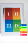
These are some of the low-fidelity prototypes that we have come out from the results of the information organization that we had done. We based the requirements that the planner should help users prioritize their tasks effectively. We had an idea of using the four quadrants to “upgrade” the current to-do list we usually use to note down our tasks. We felt that the generic to-do list does not help users to prioritize their tasks, and only serve to tell users they have this list of tasks to do.
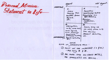
We had a page on personal mission statement in Life section to let the users to define their roles and values in their life so that they could plan their activities and tasks with accordance to these values. The next page shows the draft of the 4 quadrant idea that we tried to utilize in our planner.
We thought of having the users to write down their tasks on pieces of stickers, and then stick these stickers onto the different sections of the quadrant to let them to arrange the tasks according the degree of urgency and importance.
The weekly roles page to let users to define their roles in their life such as a son, student etc) in a week so they can prioritize with reference to their values so they are able to have a balance life.

The weekly view has an additional prioritize tasks section right above the beginning of each day so that the users are able to write down their tasks when they do not know where to put them in the timeline.
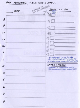
This is the daily version of the planner with the timeline and a small to-do list. We also came out with another method other than the quadrant method which is to use colour stickers to rank the importance of each task so that the user would know at a glance which tasks are more importance and try to do them first.
Below is the another version of the weekly section with additional column for notes.


High-fidelity prototyping
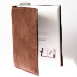
Tada! Our high-fi prototype, the planner!

One of our group members went to get a felt like cloth from spotlight and sew the cloth to make the kind of the planner cover’s material that we intended to be. Added with the papers, ruler, and a detachable plastic cover with the quadrant to-do list slotted in. for the stickers, we were trying to look for transparent, plastic and writable kind. But we could only find colourful ones from bookshops, and we discovered the problem that it is easily to be smudged if written with a wet-based ink pen. So we just made do with the colourful stickers.
After we let the user to try using the product, we discovered many problems. Mainly small details, like holidays, some boxes colour in the notes/memo section, adding in the dates and day etc. many of them said that the daily section is kinda redundant since we already have weekly and monthly, and having daily will make the planner to be very thick and it could make it difficult to be carried around.
Many of users said that the quadrant to-do list is a new and nice idea. They said that it is not something that they will use every single day but occasionally if needed. However, it is a useful function to be included in the planner. We also find that the red and the blue colour in the 2nd and 3rd quadrant have to be switched.
Overall, the planner cover is nice to hold and it is quite a good one.
Filed under: Uncategorized | Leave a Comment
Reflections on User Research Smoke & Mirrors, Part 5: Non-Scientific User Research isn’t a Bad Thing
This article is mighty interesting. In fact the entire series is interesting, and I would recommend a quick read around them.
I find it amusing in the world of user research and experience design that it seems through the article, researchers seem to believe that lending some amount of scientific credence to their research would somehow make the research good. The whole series was dealing with the absurdity of some of the quantitative sort of research methodologies used. As i went through the series, i began to understand a little better the questions that I’ve had concerning some of the user research methodologies learnt. It is hard to quantify something that is in essence qualitative. An experience, to say the least, is hard to write down in facts. I often find myself pondering the question if I really could measure the success of a product(the experience it builds for the user) through a survey form with various statistics.
In an area like crafting an experience, many a times the most “unscientific” of methods offer useful research in developing product experience. I think scientific methods are over-rated. Science always works on replicable phenomena. Because science is based on fundamental physical rules, phenomena observed should in theory be replicable anywhere, anytime. If user-research methodologies can offer such garantees of success in its methods, that would appeal to many. The pursuit of a quick-fix through replicating formulas of success is what I believe really belies the mindsets behind user researcher’s who claim “scientific”.
Unfortunately, in user research, we deal with a fickle-minded subject – The Human Being. Shaped by different experiences, different character traits, different cultures, different mindsets and paradigms, different emotions, and the list goes on. The human being is subjective. No 2 human beings are ever exactly alike. Even twins differ in character and many a times preferences. It will be hard pressed to find methodologies that express a common denominator when there isn’t.
I really liked what Zeldman said, that the user is never wrong. Not even when you have done everything you possibly could to help him understand and he still doesn’t. We just have to admit it isn’t perfect science here. In fact, I am compelled to believe that we should appreciate its subjectivity and research methods that reflect the subjective nature are also in greater alignment. The user research that genuinely helps designers develop products that crafts experiences in themselves need to be immersed and reflective of that qualitative experience.
Unscientific tools like user personas, while unscientific, fits very well into helping designers to visualise the product and its users. To design a product with the end in mind. Increasingly product design needs to appeal not only to functionality but also towards the minds of the user. Products today are much more sophisticated. It no longer is sufficient to design products that “do” something. Products need to give users an experience. The functionality is part of the user experience. It isn’t just enough for a lamp to give light anymore, it is more important how I feel having it around and how i feel using it. Now that’s subjective… entirely. What I think is most interesting about such subjectivity is that opinions can also change.
But to put things a little into perspective. I think it is important to know how and why people respond to things created but quantitative numbers are also important facts to help you arrive at possible interpretation and deduction of these data.
Filed under: Uncategorized | Leave a Comment
Phase II: Define
Attached are the slides presented. Pause it if you want to read the slides 😉
Looks like it’s time to define things. We finally nailed down the requirement and needs, and at this stage we are beginning to do some user research. What are our user profiles? And developing personas for users(this one’s quite a walk down imaginery lane 🙂 ).
Let’s see, as with the Discovery phase, we never seem to get things right the first time… and sometimes even the second time. It was quite clear as we developed the user-profile that he was going to be someone who has to juggle a number of different responsibilities in life, frequently on the move because of these responsibilities. We decided to further scope the user down to students, a profile which we were intimately familiar with 😛 So we began to look at University Students who were taking up come form of CCA, or involved in an external organisation or community(like a church or a sports club) and perhaps even a part-time job of sorts(tutoring, etc…). As we develop personas, we began to realise that perhaps the best users attracted to our products, may not be those who already use some more refined personal form of management tool to deal with their rather hectic schedules and are in some sense relatively successful. Rather, we realise that our product would really appeal much more to those may have tried to be productive but still feel that they are falling short of it. They may not be very educated in managing their time, but because they are not deeply entrenched in some existing method, they would be more willing to try as well as more adept to try our solution without having to unlearn their previous knowledge of productivity-management. The other anti-persona we developed, Osman, who was the epitomy of a free-willing spirit, we thought was just the right person who won’t use our product. It turns out we were wrong about the way we defined an anti-user. What actually got us thinking was when we realised our previously defined advance-user who may already have some deeply entrenched method to work out her currently extremely hectic schedule might just be our anti-user, as she would be resistant to have to unlearn and relearn a new method that she wouldn’t be sure would be as effective or more effective then her prior methods until she tries it. Mind boggling, all this user persona stuff. We found the process more iterative then a set and done deal. our user persona’s helped us to really clarify who we were designing this product for and why.
From there we seek to define the requirements. User requirements and Functional Requirements. With a clear user in mind the user requirements and functional requirements did not seem to far off. We knew it needed to be light and portable so it would be brought about everywhere. We know our product had to look good to use, as there was no point in an ugly solution that was an eyesore to use everytime. It had to work with the way students work. It had to functionally track events, appointments and tasks. It had to functionally be an agent to help kick-start the process of planning their tasks and appointments to be more productive. It had to functionally aid the planning to be better and easier.
Our experience strategy then came to simply crafting an experience that will enable the user to feel empowered, a sense of accomplishment, a sense of order, an uplifting positive feeling, a short and sweet feeling. No drawn-out process of planning.
Filed under: Uncategorized | Leave a Comment
Phase I : Discover
What do we do? That was the questioned that plagued us for 2 weeks! We’re beginning on the final project to develop an end-product using the user experience concepts that we have learnt and will continue to learn in the weeks ahead. But what product??!!
Then came the idea of a toilet clip to allow ladies and men to hang their bags and umbrellas at public toilet cubicles and urinals. I mean, there are just numerous toilets out there that just don’t seem to think that people carry any bags around with them these days or the handles are broken. We even thought of elaborate ideas for design and packaging and etc… Great idea, right? well, maybe. But it did not seem to meet the requirements of phase I. We had the the product in mind at the same time as the need without really giving enough thought about what the needs really are.
So, there we went, back to the drawing board again and asked ourselves what were the needs in our world and environment today. We started thinking about basic needs first. Slowly we began to think of the need for individuals to be equipped with lifeskills. Basically, what lifeskills we are talking about includes productivity management, cooking, character, social skills, team dynamics, leadership, parenting, etc. There are many books written on it, but there hasn’t been anyway to really do this in a systematic way like how hardskills are being taught in schools.
We presented this with a report. Then we realised that this was well over our heads, and we wondered if there was really a product that could solve this problem? We then narrowed it down to productivity management. What we need is a tool that will really help us manage our productivity! Help us learn, help us to be more productive, help us to feel more empowered over our time and productivity. That’s our need! Day in and day out we hear and we complain ourselves that we haven’t got enough time. We have too much things to do(which i must say is true and is curbing our time for reflection and creativity! I hope whoever is controlling the amount of work i get in university is HEARING THIS!). We do complain about days where we are feel unproductive. We throw out exercise in favour of work, and soon we fall ill, but still we work. We’re fighting one fire after another. We don’t even spend time with family anymore! is someone out there listening?!! anyway, you get the gist of it…
We identified, that people do not lead a balanced life(they need to if they think long run). They need to be more productive. They need to move from survival mode in dealing with tasks to preventive modes in dealing with tasks(inorder, to get that “I’m in control” feeling that we all so desire over our tasks and responsibilities)
Now that’s the need…. 🙂nm4210-need-analysis-report-for-a-product
Filed under: Uncategorized | Leave a Comment
Four pleasure analysis
* Expand RMA profile you worked on in the seminar room into a story (target user profile)
* Analyse user profile using four-pleasure framework
* Identify user need pleasures and pleasure of appreciation
* Prepare “product benefit specifications”* for a hand phone for your target user profile.
Profile
Yumi(not her real name) is a 17 year old high school student. Her father’s a doctor and her mother’s an accountant. Her parents are rarely at home given the nature of their jobs that require them to remain late in the office. Her parents try their best to make up to her by getting her presents on their work trips.
Yumi is an avid fan of japanese pop culture. Her room’s filled with manga comics and plush toys of various Japanese comic charactors. While she could easily buy her comics from a regular neighbourhood comics connection, she would rather head to kinokuniya to purchase her regular staple of comics and anime. Her favourite charactor would have to be Hello Kitty as she was showered with Hello Kitty toys since a young age. Hello Kitty and Dear Daniel is almost like a fairytale romance that she loves.
Yumi’s favourite haunts include sushine plaza, where she meets up with friends and goes through their latest comics. She loves to follow after the latest fashions from Japanese magazines like “Egg” and particularly likes her dresses with lace. She’s only 1.6metres tall but loves to wear her hemlines high up as they really make her legs look long and instantly makes her seem that much taller.
Another favourite pastime of hers is to go for a pedicure and manicure. Its an enjoyable time she has frequently as she changes different patterns and charactors to be painted or encrusted in crystal on her nails. Not to mention, her ever-changing nails are always a talking point for her friends as she takes pride in talking about her latest choices of designs and the fashion sense it makes.
Exercise is never a priority in her life, in fact, Yumi hates to sweat. She always reminds her friends how God has given her a body that would never grow fat no matter what she ate. She silently relishes in the comments of envy she gets from her peers.
Amongst her other hobbies, she loves to cosplay and in fact is a member of her polytechnic’s cosplay club. Though she’s been asked to be an executive committee member, she doesn’t revel in the idea of taking up responsibilities. “Life should be fun, not adult-like borish”, as she would frequently say.
Perhaps its this streak of dislike towards being responsible for anything that often creates tension within her family. Her parents expect her to “grow up” and be serious with her studies and her future, while she hates to have to imagine herself in a deskbound job or even this notion of doing anything that is not within her interests simply for the sake of having food, drink and shelter.
She hopes her interest in cosplay would someday bring her to Japan where she could be a designer for alternative fashions or at least be someway involved in the process.
Physio-Pleasure:
Socio-pleasure:
Psycho-pleasure:
Ideo-pleasure:
Product Benefit Specifications: (Handphone)
Filed under: Uncategorized | Leave a Comment
Products and Emotions
Why do people need so much shoes? especially of the fairer gender, there would be tons of shoes!
The wall of shoe boxes beside the shoe rack at home is quite testament to the amount of shoes my mom and sister can horde. As a matter of fact, they would hardly remember all the shoes they own, much less which box they’re in.
I’m going to talk about the different kinds of shoes and its emotional impact on people.
Visceral Impact!
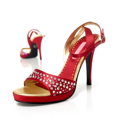
Its a clearly visceral emotion that this product evokes to the consumer. The sexy curves, killer heels and passionate red are yelling “sexy” and to top it with a bit of class, the crystals evoke a sense of elegance.
Why women punish their knees, calfs and ritualistically go through the passage of womenhood by learning to walk on these sorts of high heel shoes would perhaps remain a mystery to half od mankind. But undoubtedly, despite being a health hazard and being uncomfortable to walk long distances in, women continue to make decisions to purchase and wear high heel shoes on its visceral impact.
Alright, so do men react to women in high heels purely from its visceral impact as well, I guess.
Behavioural

Now Birkenstock sandals are really quite plain look if you ask me, but so many people have fallen in love with them.
The ergonomic looking design and suede leather finish have made many people comment how comfortable it is to wear and walk around in them that we now have a whole lot of people wearing Birkenstock sandals because they are comfortable. With all the cheap imitation flooding the market these days, getting an original birkenstock (which is quite expensive for a sandal) also does seem to carry some amount of “prestige” with it. I would say that for most who would get a birkenstock or birkenstock look alike sandal, it would really be for the comfort of walking in them.
Reflective

Personally, crocs are one of the most ugly looking contraptions ever designed by a human being! It looks really cheap because of its rubber/plastic like material and the great number of holes in the shoe. What’s amazing is the throngs of people who spend good money on them. Aethestically, it unpleasing to say the least. Behaviourally, it looks difficult to walk around with. There are people who claim that crocs are actually very comfortable shoes. Most who do own such a shoe in Singapore probably got the imitation version(which I might add is tons cheaper). These proved dangerous for children who wear them when a Straits Times article reported on how a young girl lost her toe on the escalator when her imitation crocs were stuck.
why do people flock after crocs if its ugly and possibly dangerous to wear? I can only conclude that when an individual buys a croc or croc like shoe, it would be largely a reflective process. A process of thinking what would getting an ugly shoe like this do to me? And the notion of how it will seem to make a fashion statement about them being classified within a group of people who subscribe to this fad of fashion (especially in its initial phases before all the cheap imitations flooded the market). Its a “different” shoe and people wanted to be associated with being “different” bought crocs. Therefore I believe that to buy a pair of crocs is largely a reflective emotion.
Comments
A variety of factors affect the way we purchase products from virtually any category. I specifically chose something as simple, needed and used-daily product as a shoe to try to understand if a product that is so functional as a shoe for walking would involve emotions that are more then behavioural in the selection process. I must say I had a hard time in the reflective category to find a product that was clearly bought an a reflective emotion rather then by initial impact or its functional usage.
All own shoes. Some more then others. All shoes are equal. Some more equal then others.
Filed under: Uncategorized | Leave a Comment
Now… isn’t that easy? After all, the world is filled with badly designed products. from handphones with buttons too small for even an imp to use to…. microsoft windows? Actually it was difficult to find a product that stood out from the rest especially since I’ve been so conditioned to live with all the flaws of devices I use daily from doors that refuse to lock from the outsides to having to wind long meandering cables around my devices because I have no idea what to do with so much excess cable length.
Anyway, one design did stand out for bad design. and here it is :

Interviewed a friend who commutes to and fro Cityhall MRT with similar benches about his experiences with them.
The first time i saw the bench, i thought to myself “wow! SMRT actually installed more benches” . Little did i know the product was severely flawed until i sat on it. It was a great disappointment. The problem with the bench was 1.) the seat was tilted downwards at an angle and 2.) The seat is slippery. Instead of giving my legs rest, i had to expend more energy to keep myself on the bench. i gave up after a minute of trying. Appalled that SMRT could make such an error. It’s actually more surprising that those benches are still around despite numerous complains.
– Alex Goh Undergraduate Student in SMU.
It natural that the user should feel disappointed in the product as many would expect benches to be for seating and more importantly to help alleviate the stress and fatigue on their legs as they wait for the MRT. Alex’s interactions with the bench showed clearly that instead of giving his legs some rest, he had to expend more energy trying to keep himself on the bench. Interesting he tried to learn ways of possibly trying to use the bench and hoped that he would find some way that would help him rest his legs, but ultimately gave up and concluded it was not possible. While, the product was not by SMRT, clearly the responsibility for badly designed benches seemed to reflect negatively on the SMRT brand image, although benches are not its products.
I think that many designers for modern contemporary products have seeked aesthetics ver much at the cost of functionality. A beautiful looking bench that cannot fulfill its role as a bench is better off as an installation art piece that brings grief to its interactions with passers by. At least some grooves on the benches might have helped to create some much needed friction. Again, it brings to question the fine balance between form and functionality.
Filed under: Uncategorized | Leave a Comment
Welcome! Though this will likely be a blog that will not exist for too long beyond the module’s span of life.
Nonetheless, this would be a record of my learning experiences.
Hope you enjoy
Filed under: Uncategorized | Leave a Comment
